A simulated fleet management dashboard designed during a Google apprenticeship capstone, exploring how operators could monitor, dispatch, and maintain autonomous vehicles at scale, through a centralized, real-time, and human-centered interface.
Role
Product Designer Engineer
Duration
12 Weeks
Team
1 Backend Engineer
2 Simulation Engineers
1 Project Manager
Tools
Figma, Maze, Loom, React + Vite, Tailwind CSS
The Problem
Story:
At 6 p.m. in a rush-hour simulation, 200 autonomous cabs crawl through downtown SF. Dispatchers juggle ride requests, blocked roads, and battery warnings, using three disjointed tools and half a dozen browser tabs.
Tension:
Real-time chaos + incomplete data = missed rides and stranded passengers.
Goal:
Design a simulated fleet management dashboard for autonomous taxis that envisions how operators might monitor, dispatch, and maintain vehicles at scale, through a centralized, actionable, and operator-focused interface.
Impact

Operator Efficiency
Designed flows reduced key task time by up to 34% during simulated trials (alert response, ride assignment, issue resolution).

Workflow Continuity
Enabled seamless transitions between monitoring, dispatching, and maintenance, removing the need to switch tools or tabs.

Resolution Speed
Average time to triage and act on a critical alert dropped from ~15 seconds to under 6 seconds in user walkthroughs.
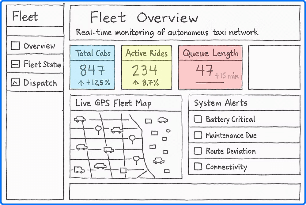
We designed a simulated fleet management system that brings everything together in a single command center. It empowers operators to respond faster, reroute smarter, and maintain vehicles more efficiently.
Designed for Decision Speed
Both screens prioritize clarity and actionability. Visual hierarchy, color-coded signals, and two-click responses make complex decisions feel simple.
Operator-Centric Design
This workflow was shaped by real dispatcher pain points: too many tools, too little context. The result? A system that works the way they do.
Helping Operators Choose Smarter Routes in Seconds
What It Is
A module that compares current vs. optimal route times using real-time + historical traffic data.
Why It Matters
Gives dispatchers visual evidence for re-routing decisions: no guesswork, no extra clicks.
What It Improves
Saved an average of 5.7 minutes per ride
Boosted trust in system suggestions
One-click “Apply Best Route” to push to live dispatch
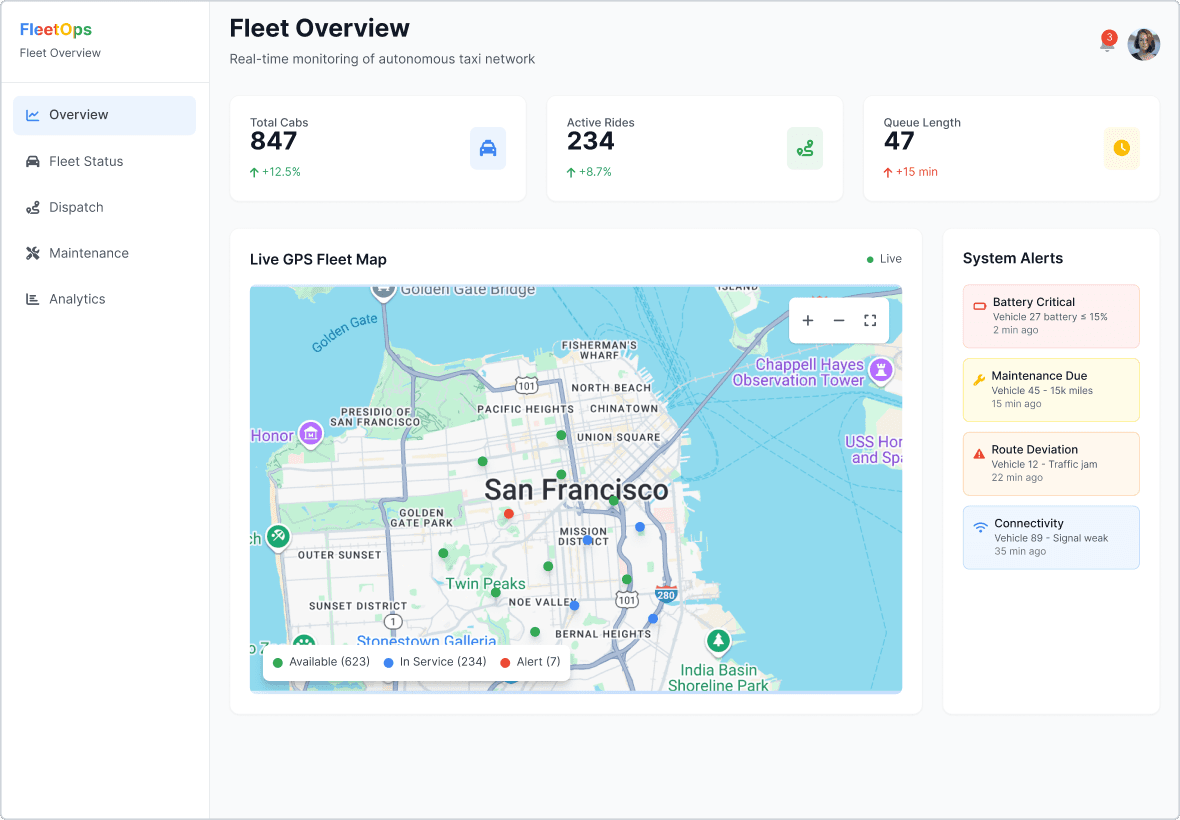
Making Alerts Instantly Actionable, Not Just Notified
What It Is
A real-time feed of critical issues, battery, maintenance, routing, or connectivity, linked to quick actions.
Why It Matters
Replaced scattered warnings with one centralized, color-coded panel. Each alert opens a vehicle modal with status and instant options.
What It Improves
1-click triage (e.g., Send to Charging)
22% faster fault resolution
No more missed alerts
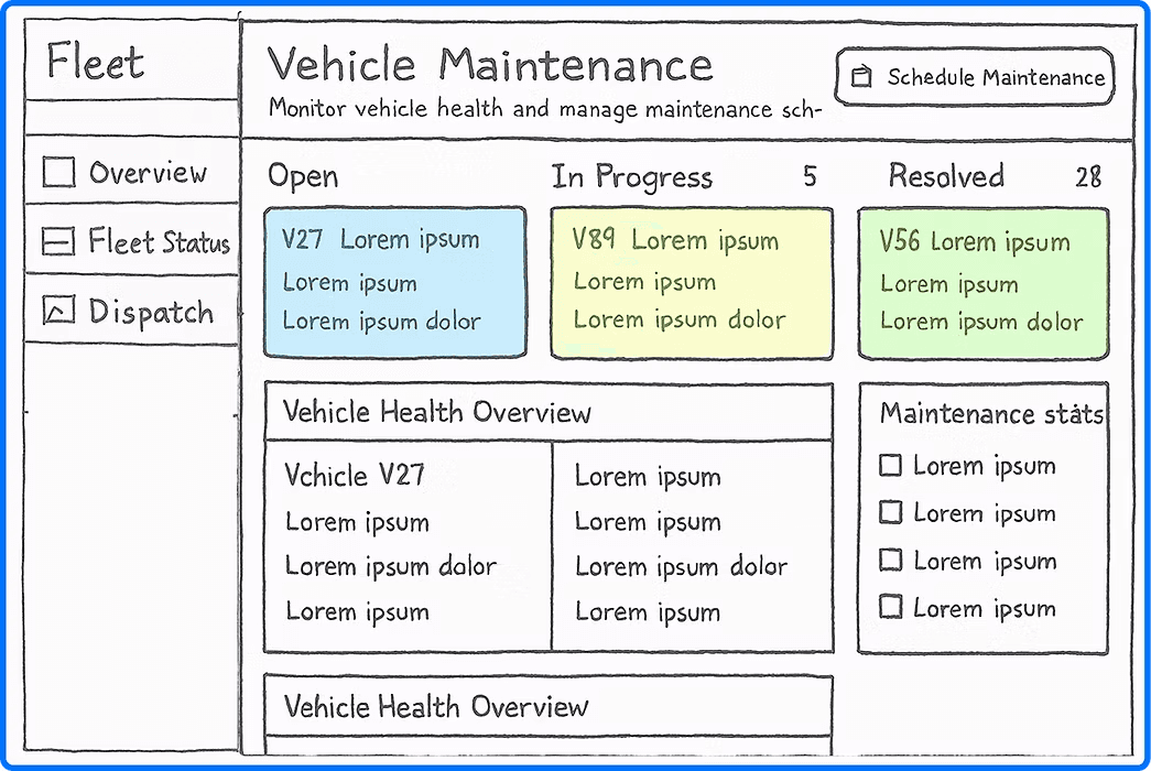
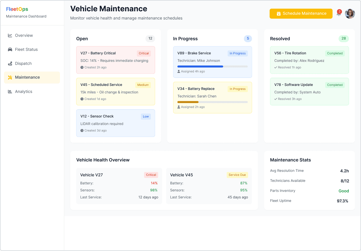
Tracking Maintenance Without Spreadsheets
What It Is
A maintenance board that tracks issue status (Open → In Progress → Resolved), paired with real-time health indicators and fleet stats.
Why It Matters
Operators no longer rely on spreadsheets or email threads to monitor vehicle status, everything from battery alerts to service logs now lives in one place.
What It Improves
Drag-and-drop ticket updates
Avg resolution time: 4.2 hours
Fleet uptime: 97.3%
Designing for autonomous fleet ops came with a unique challenge: this exact workflow doesn’t exist yet. Companies like Waymo and Zoox operate these systems, but we didn’t have direct access to them and local fleet managers don’t manage autonomy at scale.
Who We Spoke To:
Dispatchers, juggling vehicles, routes, and requests
Fleet supervisors, monitoring live performance and vehicle availability
Maintenance leads, coordinating service and tracking issue logs
In total, we ran:
10 stakeholder interviews
3 usability walkthroughs
1 card sort focused on alert prioritization
What We Heard: Insights That Shaped the Dashboard
Monitoring Notes

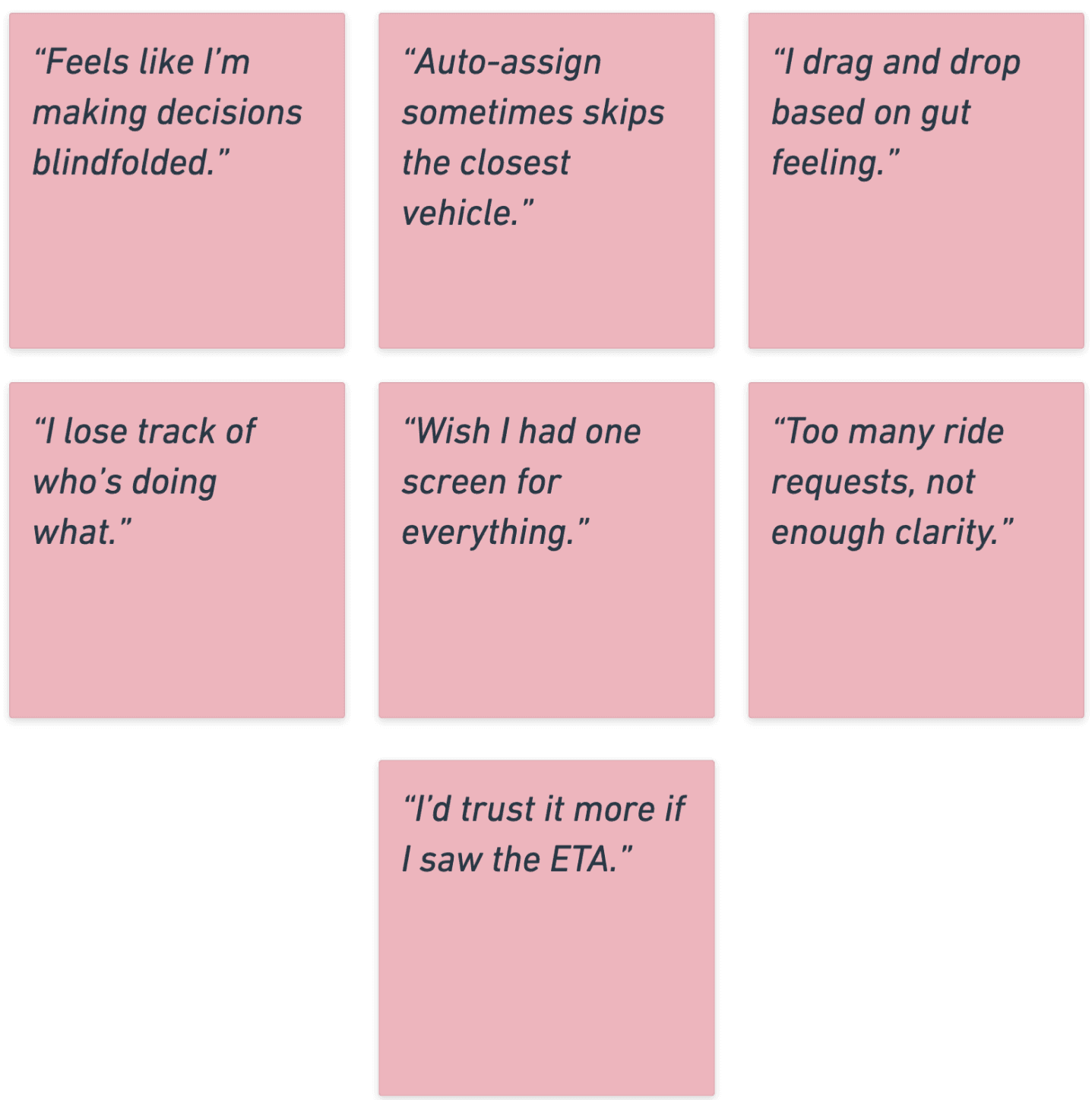
Dispatching Notes
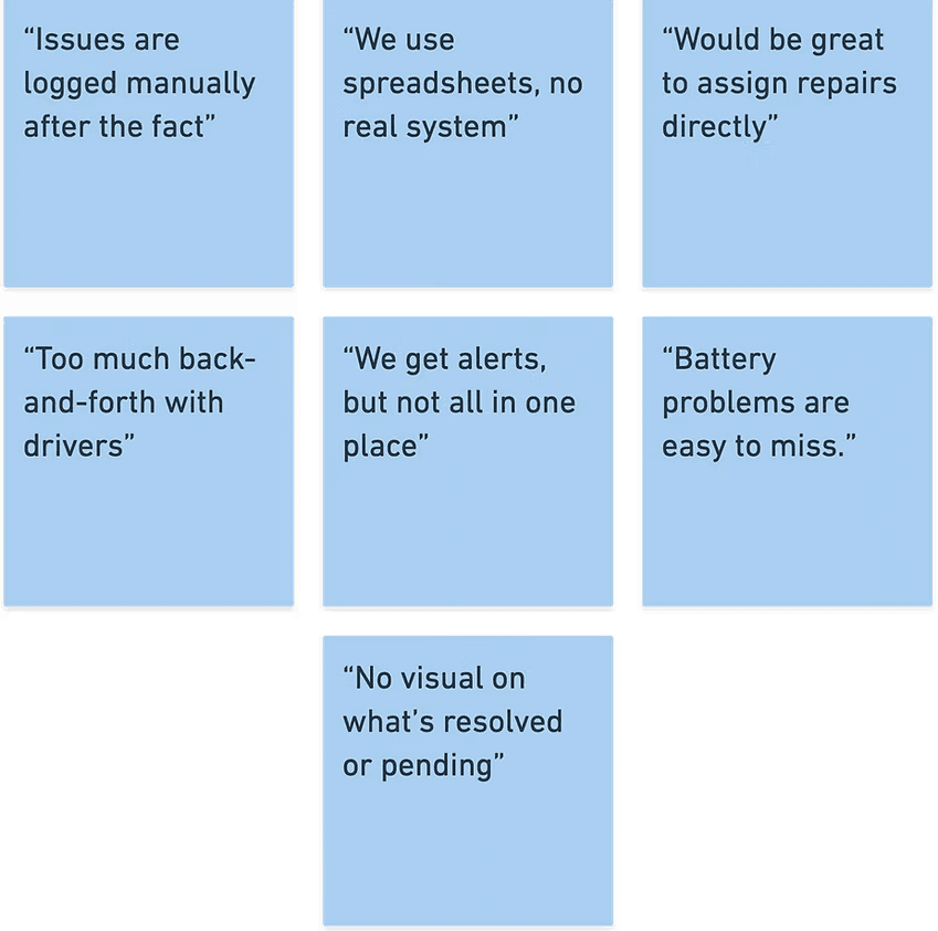
Maintenance Notes
Through the interview, we found that
Operators lacked a single source of truth
They were toggling between 3–6 tools to answer basic questions like: Is this vehicle idle? Is it in trouble?
Dispatchers needed visibility to build trust.
Without ETA context or visual feedback, they didn’t trust auto-assign logic and often made decisions manually.
Maintenance workflows were fragmented.
Issues were reported verbally or after the fact. Tracking statuses, assigning work, and closing the loop all happened in different places (or not at all).
Map-based interactions were a common request.
Users wanted to see vehicle health and availability in the context of location, especially for resolving blocked or delayed rides.
From Insights to Interface: Sketching the System
With the core pain points clearly identified, we moved into translating those needs into structure. The goal was simple: build a system where information is visible, decisions are intuitive, and actions are immediate.
We started with low-fidelity wireframes to test layout logic and hierarchy. Each screen was designed to answer a specific question:
Fleet Overview: Is my fleet running smoothly right now?
Alert Panel + Vehicle Modal: What needs attention and what can I do about it?
Maintenance Dashboard: Where are we in the resolution process?
With the layout locked, we shifted focus from what lives on each screen to how those elements behave in a live environment.
Our design principles centered on:
Fast cognition → Alerts pulse, KPIs update without reloads
Seamless flow → Clicking an alert leads directly to a vehicle modal
Minimal friction → Most actions are just one or two clicks
We ran internal usability simulations and walkthroughs with operations-adjacent users to stress-test the system’s logic and clarity.
Users were asked to:
Triage incoming alerts
Investigate vehicle status
Assign a repair action
What Users Had to Say:
If This System Went Live Tomorrow...
This project was a simulation, but it surfaced real design principles I’d carry into any ops-critical product:
Design for action under pressure, not just visibility
Validate clarity through task-based testing, not just screens
Center workflows around the humans behind the dashboards
If I had more time (or access to real AV fleet ops), I would:
Explore how this system could scale to 10× more vehicles
Add an AI co-pilot mode for proactive issue surfacing
Build a training flow for onboarding new dispatchers
Design a mobile-ready version for technicians on the go