InterstateShipped: Aug 2026

Making a visual direction enforceable

Interstate had a written visual direction and nothing that made it true. Over seventeen PRs in a 30-contributor trading terminal, I turned the document into mechanisms: one geometry class, one token vocabulary, and a drift check that fails CI when a file gets worse.

Role
Design Engineer
Team
Design Engineer (Me), ~30 contributors in the codebase
Timeline
Jul–Aug 2026
Tools
Paper, Claude Code, Next.js, Tailwind v4

Interstate had a good visual direction written down, and nothing that made it true. I spent three weeks converting it from a document into things you'd have to actively break, and the most useful thing I built counts my own work as debt.

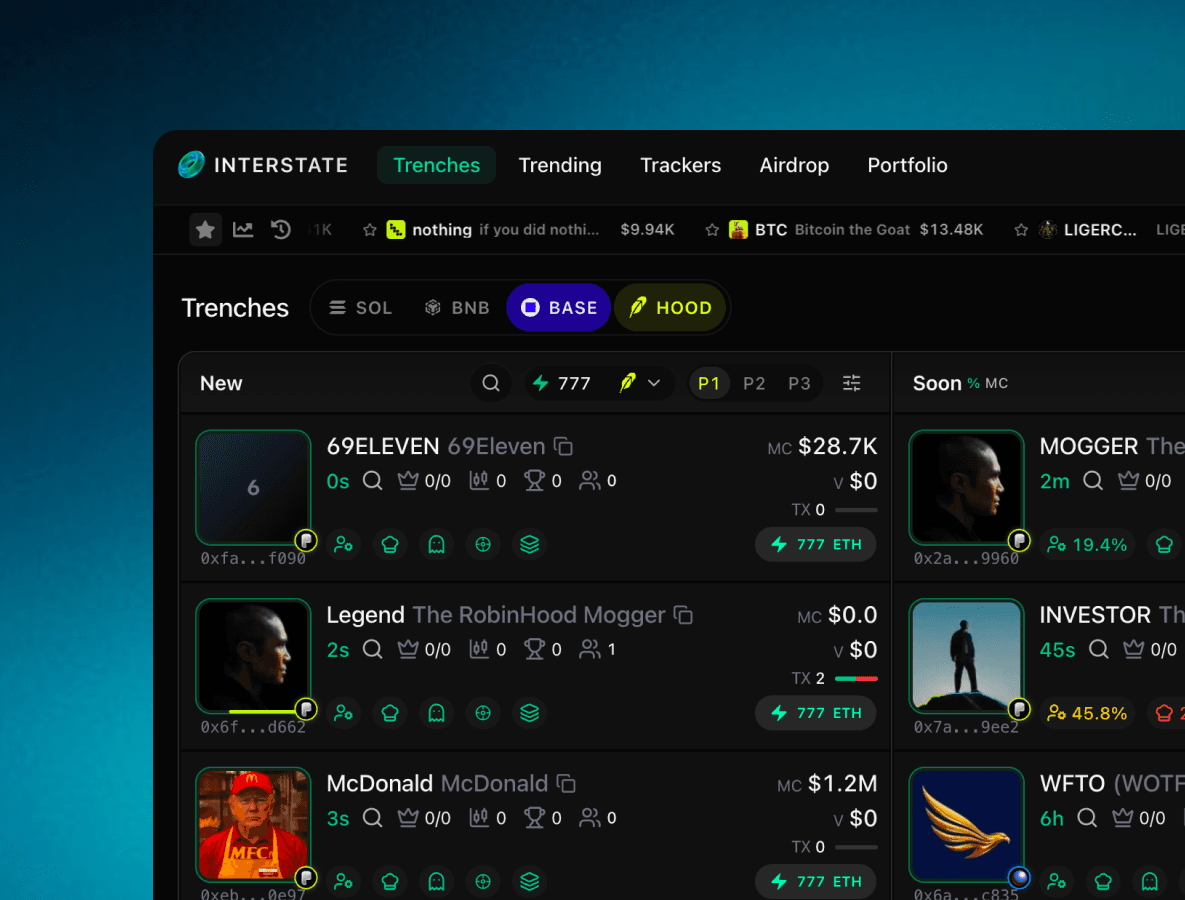
The landing page, rebuilt as a live market board on the shared system. Real quotes, real motion, not a mockup.

I owned

  • System architecture
  • Token vocabulary + alias map
  • Shared geometry class
  • Header IA
  • CI drift ratchet
  • Landing page rebuild
  • 17 PRs, authored and shipped

Shared

  • Review with the engineering leads
  • Rollout sequencing

Not mine

  • The Graphite Noir visual direction
  • Product roadmap and route ownership

I was the only designer in the codebase. Nobody handed me specs and nobody merged for me: every change below is a pull request I wrote, defended in review, and own the consequences of — including the two I got wrong.

The situation

Every screen was styled correctly once, and never again

Interstate is a multi-chain crypto trading terminal. Roughly thirty people commit to one Next.js app, and the surface area (four market boards, a trade page, portfolio, trackers, landing) grows faster than any one person can review.

The result wasn't an ugly product. It was an inconsistent one, in the specific way fast products become inconsistent: every screen was styled correctly at the time it was built.

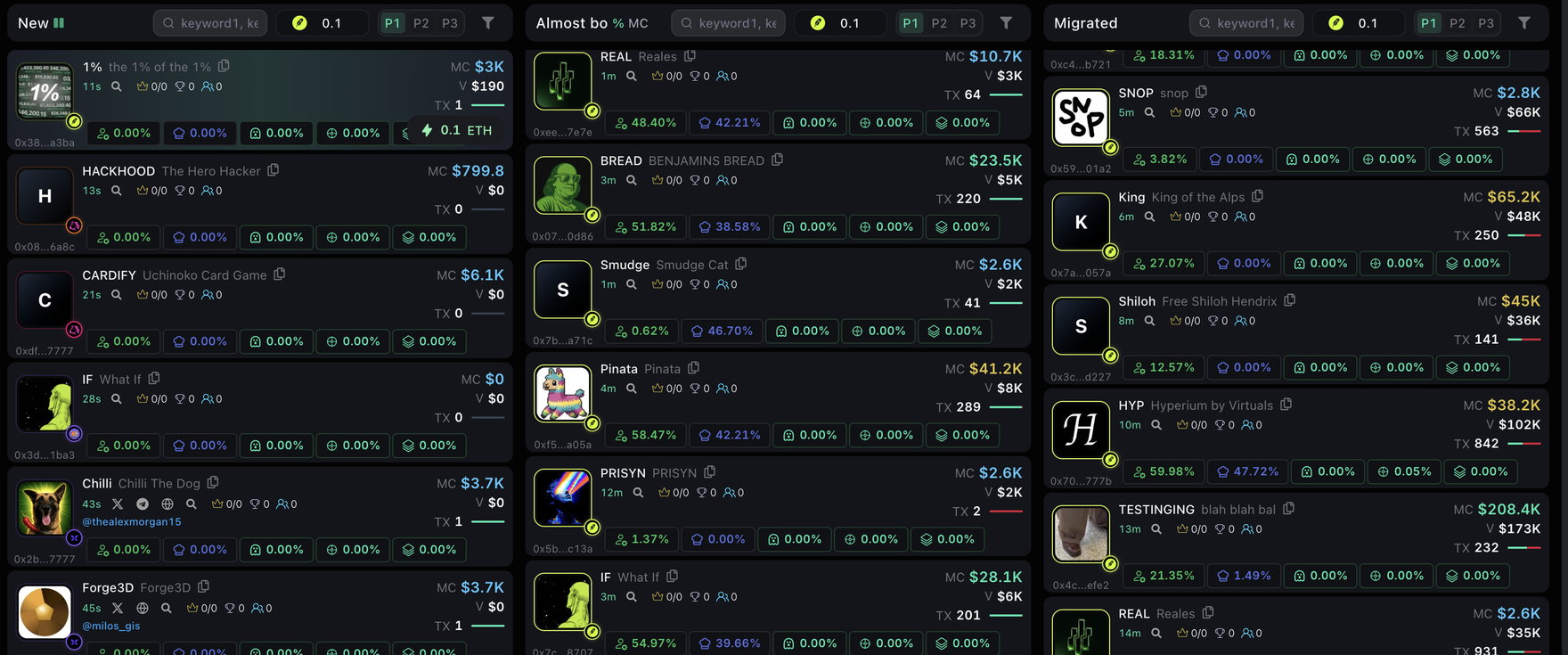
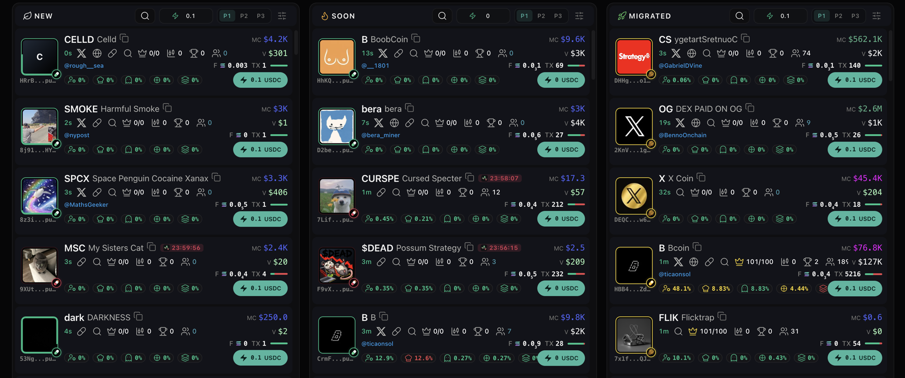
The clearest symptom was the header band on the four market boards. Same component role, four different sizes:

4market boards, four hand-tuned header bands
44.2 / 46 / 39.05 / 39.75px tall. Switching tabs made the row visibly jump
5parallel colour vocabularies in one stylesheet

Underneath that: legacy token names, shadcn defaults, five private palettes living inside individual components, and raw hex inline. And a spec called Graphite Noir, written by a colleague two weeks before I started, that was genuinely good and entirely advisory.

That spec is worth showing, because everything I did afterwards is in service of it. It is a surface ladder rather than a palette — seven steps of near-black that differ by two or three points of luminance, so depth comes from stacking order instead of from shadows and blur.

Graphite Noir · surfaces — my colleague's direction, not my work

--surface-canvas

#060607

page void behind panels

--surface-sunk

#0c0c0e

input wells, header strips

--surface-panel

#0e0e10

milled panels and cards

--surface-panel-top

#111114

lit top edge of the gradient

--surface-elevated

#151518

hover rows, active segment

--surface-overlay

#1b1b1f

modals, dropdowns

Ink — exactly three tiers, and the only hue on the page

--ink-1

#f5f5f4

primary · ~17:1

--ink-2

#b5b5b1

secondary · ~9:1

--ink-3

#7e7e7a

tertiary · ~4.6:1

--status-buy

#12c48b

buy / up

--status-sell

#e5484d

sell / down

--status-warn

#e0a83e

warn

The type scale is named the same way — for where it lives, not for a t-shirt size. sm invites the next person to pick a different one; column label doesn't.

Type roles, set in the words that actually ship in them

Sub-nav tabTrending14/600
Band labelSolana · Top movers14/500
Header nav linkPortfolio13/500
Key number$0.00312213/600 mono
BodyLiquidity is thin on this pair.12/400
Panel headerOpen positions11/600
HUD labelLAST TRADE10/600 mono
Column label24H VOLUME9.5/600
Two families, eight roles, one rule: Inter carries language, mono carries anything a trader reads as a number. Tabular figures are the reason — without them a price jitters sideways every time a digit changes, on a screen where the digits change constantly.

Radius — by role, never one value everywhere

--radius-panel

12px

panels, cards

--ds-radius

8px

controls, inputs, chips

micro

4px

table badges

pill

9999px

pills

Four rungs, and which rung something sits on says what kind of thing it is. A control that borrows the panel radius stops reading as a control.

Elevation — three real steps, and the glows switched off in place

--shadow-sm

shadow

resting

--shadow-md

shadow

popovers

--shadow-lg

shadow

modals

--shadow-glow-md

none

was an accent glow

The last two are the alias decision in miniature: --shadow-glow-* still exists, is still referenced everywhere it always was, and is now none. Nothing had to be deleted for the surface to go flat.
Trade
The densest surface in the product. Every ink tier is doing a job here: the pair name at ink-1, the labels under each stat at ink-3, and the numbers in mono so a price ticking doesn't shift the column. The only colour on the screen is buy/sell.

The rule that makes the whole thing hold: chrome is grayscale, and hue means money moving. A trader glancing at the screen should be able to read direction from colour alone, which only works if nothing decorative is allowed to spend it. Most of my token work is enforcing that one sentence.

That last part is the actual problem, and the only one worth solving. Not "make it look flatter", but make the flat direction hold without me in the room. The direction is my colleague's work. Mine starts where it stops being a document.

The idea

Replace conventions with mechanisms

A convention is something people have to remember. A mechanism is something they'd have to actively break. One idea, applied at three scales:

  • Geometry. Four hand-tuned bands became one class that owns height, padding, gap and alignment.
  • Tokens. Many colour vocabularies became one canonical set, with every legacy name aliased onto it rather than rewritten.
  • Information architecture. Two competing header controls became one control whose options name their own scope.

Every geometry value came from measuring the running app against a reference board, not from taste.

Every value in here was DOM-measured against /discover rather than eyeballed.

PR #1266

Market board header band · DOM-measured in the running app

Before · hand-tuned per board

/discover44.2
/pulse46
/trackers39.05
/portfolio39.75

After · one shared class

/discover44
/pulse44
/trackers44
/portfolio44

spread 6.95px → 0px

Not a screenshot: each row on the left is drawn at the height it actually was, and each row on the right at the height the shared class gives it. A 6.95px spread is invisible in a static image at this width and obvious the moment the boxes are the measurement.

The method matters more than the number. I picked one board as the reference and measured the rest against it, rather than opening a design file and re-deciding what the height should be — a redesigned value is one more opinion for the next person to disagree with, a measured one is just what the product already mostly did. And the class owns height, vertical padding, gap and alignment together, because those four drift as a set: pin the height alone and the jump moves into the padding.

The decision I'd defend

Alias the old names instead of deleting them

The canonical set was the easy half. The interesting decision was what to do with everything already referencing the old names.

Rewriting every call site meant a three-hundred-file diff in a repo with no visual regression tests and thirty people mid-flight, so I pointed the legacy names at the canonical ones instead. One file changed, and every screen inherited the direction, including screens I had never opened, owned by people I had never spoken to.

Legacy names, repointed rather than replaced

  • --bg-void
  • --bg-deep
  • --bg-base
--ds-bg
  • --bg-elevated
  • --bg-surface
  • --bg-card
--ds-surface
  • --bg-hover
--ds-raised
  • --border-subtle
  • --border-default
--ds-line
  • --border-strong
--ds-line-2
  • --text-primary
--ds-ink
  • --text-secondary
--ds-ink-2
  • --text-tertiary
  • --text-muted
--ds-ink-3
  • --accent-primary
--ds-accent
  • --accent-primary-glow
transparent
  • --color-success
  • --color-danger
--ds-up / --ds-down
  • --color-warning
  • --color-info
--ds-gold / --ds-accent-2

20 legacy names → 12 canonical · 1 file changed

Read it right to left and the argument is obvious: three ways to say “the page background” become one. Nothing on the left was touched, so nothing on the left could break.

The row I like most is --accent-primary-glow → transparent. The direction says the surface is flat, so the glow had to go — but deleting the token means touching every component that referenced it. Pointing it at transparent turns the glows off everywhere in one line and leaves every call site compiling. The same move retired --shadow-glow-sm/md/lg: still there, still referenced, all three now none.

A token you can neutralise is worth more than a token you have to delete.

Aliasing leaves the old names alive, so the codebase now has two ways to say the same thing, and that debt is invisible to a reviewer, which is the worst kind. I flagged the blast radius up front rather than letting review find it: the shared tokens and primitives are used app-wide, so this changed the look of every page, not just the one in the PR. I also flagged the one change users would actually notice, the default accent moving to teal, and preserved the stored preference for anyone who'd set their own.

This is the tradeoff I'd argue for in a review and against in a greenfield repo. On a product moving this fast it's the only version that works; on a smaller team it's just deferred cleanup.

Where I was wrong

An IA fix that put a money transfer inside a dropdown

Two controls in the header answered the same question in incompatible ways. One of them turned out to be displaying a value while dressed as a choice — it looked like a decision the user could make, and it wasn't. Merging them was obviously right, so I merged them, and moved the balance sweep down from a peer control into the account menu.

The IA reads better. It was still the wrong call, and the reason is a category error I'd make again if I hadn't made it once.

A dropdown is a surface you dismiss by looking away. I put a two-minute money transfer inside one.

The sweep isn't a setting. It's a sequence of real cross-chain transfers, and a menu's contract with the user is that it disappears the moment you look away. Those two can't share a container — and every fix I tried was a smaller version of the same mistake:

Two header controls answered the same question, and one was displaying a value while dressed as a choice. Merging them was right.

Costs the user · Nothing yet. This part I'd do again.

Each step is me trying to make a wrong placement safe. The tell is that every fix made the component less like a menu.

Three escalating fixes, each one a smaller version of the same mistake: trying to make a wrong placement safe. The design was fighting itself, and the tell was that every fix made the component less like a menu. I kept the abort guard, wrote its honest limit into the PR — a signed transfer in flight can't be recalled, so it cancels the queue, not the leg — and reverted the placement.

The part worth keeping is the question I now ask before moving any control: how long does this action live, and how long does its container live? If the action outlives the container, no amount of guarding will fix it. That's a design constraint, not an engineering one — it just happens to only announce itself in code.

The component I'd show first

Six notification skins became one plate

Tokens and a shared class fix how things are coloured and sized. They can't fix a component that is the wrong shape. Notifications were the clearest case, and the honest version of this story has three steps in it, because the middle one is mine and I took it back.

What the team had

Trade confirmed
Transaction pending…
Failed to execute swap: insufficient liquidity for this pair
Reconnecting to Solana RPC…

#1E1F26 plate on a #030304 page · 14px/500 · white / blue / coral borders · width follows the string

My first pass · reverted

Bought 1,240 BONK0.42 SOL · 1.9s

380 × 82px · fixed width · animated rail

Shipped

Bought 1,240 BONK1.9s

~254 × 38px · fits content · no rail

All three at true size, on the product's own ground. The rail in the middle really is running — it's the part you have to see moving to understand why it had to go.

What the team had was six visual treatments doing one job. The plate was #1E1F26, sitting on a #030304 page — a surface value that appears in neither token set, and nearly thirty points of lightness away from the ground it floated on. Success carried a 1px white border, pending blue, failure red. On a product whose entire colour rule is hue means money moving, the most emphatic outline in the set was spent on a state, and the blue collided with the one hue reserved for information. Thirty-four call sites also forced themselves to top-centre, overruling the position the user had chosen in settings.

Six skins isn't six decisions. It's one decision nobody got to make, six times.

My first pass overcorrected. I put everything on one Noir card — right instinct, wrong card. It was 380×82px to carry a single line, sinking the token avatar into a 36px recessed well and parking the status in a corner badge, diagonally away from the sentence that says what happened. And it ran a duration rail: a moving element on a settled trade. On a trading screen motion means something is in flight, so spending it on a dismissal countdown means the one place it should signal is already noisy. I shipped it, saw it in use, and reverted it.

What shipped is mostly subtraction. The rail is gone; a spinner does that job, only while something is genuinely pending, and sits in the icon slot rather than running under the copy. The well became a 20px avatar inline in the row. The corner badge became a ringed check leading the sentence, so status and outcome read in one movement. The fixed width became a 288px floor that short toasts share.

One card doesn't show that, though — a single shipped toast next to the old ones looks like a smaller rectangle. The change is that everything the platform can say now comes off the same plate and differs only where it has a reason to:

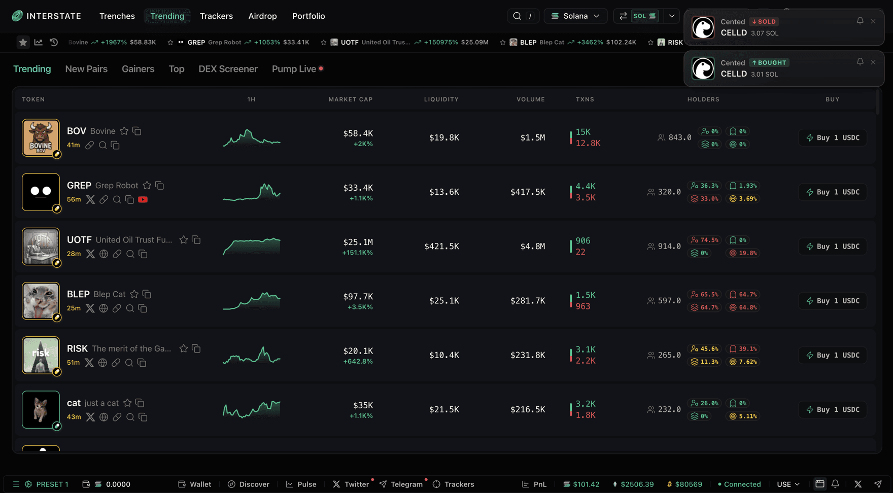
The Trending board with two shipped notifications stacked in the top right
Two of them stacked in the corner of the running product — a sell and a buy on the same token, seconds apart. At this size they read as two quiet rows rather than as an event, which is the intended outcome: the board is the thing you are looking at.

fire one

The shipped set, running. Fire a few. A trade lands pending and settles into itself rather than stacking a second card, the stack caps at three, and nothing keeps moving once a trade is done — which is the whole argument for killing the rail.

The rule I'd defend hardest is the last one: the card only grows a second line when a description, a retry or a suggestion is actually passed to it. That moves the judgement out of the component — the card doesn't decide it's important, the call site does. Roughly 370 string-message toasts stayed one row, and the 121 that carry a retry action earned two.

The rule underneath it

One red, and it belongs to money

My reverted card had put failure suggestions in a violet panel — I'd added a sixth hue family to a product whose entire direction is that colour means one thing. Catching that in my own work is the same check I was asking the ratchet to run on everyone else's.

The whole hue budget — everything else on the platform is grayscale

--status-buy

#12c48b

a fill went through, a number went up

--status-sell

#e5484d

a sell, or a failure — deliberately the same red

--status-warn

#fddb24

caught before anything was sent

--status-info

#6e9bff

sparingly, and never on a trade

Four hues, and the tightest one is the pair. A failed transaction and a sell fill share the same red because both are the same thing to a trader glancing at the screen: value moved away from you. Splitting them into two reds would buy a distinction nobody needs and cost the budget a colour.

The consequence I like is what it forbids. A rank-up in the rewards system is good news, and it stays grayscale — because nothing moved. A green there would read as a fill, and being wrong about that on a trading screen is worse than being unexciting. Suggestions became ink, and the copy does the work the violet panel was doing.

What each toast is allowed to spend

a fillHue, a ringed check, and a latency readout that turns green when it settles.
a failureHue, plus the only expansion in the set — the retry is the entire reason the toast exists.
a rank-upGrayscale. Good news, but nothing moved, so it doesn't get to look like a trade.
a copied addressGrayscale. The most-fired toast on the platform: an icon, a line, a dismiss.

Making it stick

A ratchet, not a gate

Tokens and a shared class only stop drift where someone remembers them. So the last piece counts drift per file (raw hex, inline styles, arbitrary colour classes, raw buttons) against a checked-in baseline, and fails if any file gets worse.

Not a gate. A gate blocks every PR on day one and gets switched off by Thursday. A ratchet lets existing debt sit and never grow.

The check runs on the files in the diff, not on the repo. Nobody inherits someone else's debt by opening a pull request near it.

Costs the user · Nothing. A PR that touches clean files never sees this at all.

What happens to a pull request. The only branch that fails is the one where a file the author touched got worse than it already was.
19905violations in the opening baseline, across 376 files
9rules, each one a specific way to bypass the system
656of the violations are references to my own tokens

Nine rules, because "looks off-system" is not something a script can check. Each one names a specific, greppable way to go around the tokens:

Raw hex7,115
Inline style attributes5,401
Arbitrary colour classes3,205
rgb() / rgba() literals1,410
Raw <button>, not the primitive1,281
References to my own --ds-* tokens656

Counted as debt like everything else. This is the number that makes the rest of the list mean anything.

!important473
Raw <input>, not the primitive332
styled-jsx blocks32
The opening baseline, by rule. Not a to-do list — a starting line. The check only fails a PR when a file's own count goes up.

That teal bar is the point. A ratchet that exempts its author's work isn't a standard, it's a preference with a script attached. My tokens are a migration target, not a destination — the direction they point at is Graphite Noir, and a file full of --ds-* is a file that still has a step left to take.

I wrote the migration contract alongside it: an alias map, a one-file-per-commit loop, and an explicit list of substitutions a machine must not make. About a hundred references to my accent token sit at sites that are semantically opposite: some are chrome, which the direction says must be grayscale; some are genuinely buy actions, where the target is the status colour. No single alias serves both. The valuable artefact wasn't the token map. It was knowing precisely which substitutions were a human call, and why.

What held

Four measurably different bands became one rule

I have no post-ship analytics for this work and won't claim a user metric. What I can show is that the row stopped moving, on every surface that has one:

One definition, five surfaces · counted from the shipping branch

DiscoverThe reference. Every value in the shared rule was measured against this board rather than redrawn.
PulseWas the 46px outlier — the tallest of the four. Switching between these two no longer moves the row.
TrackersWas 39.05px, the shortest. The 7px jump between these two was the symptom that started all of this.
Trackers, legacyThe old route, still reachable. It inherited the rule rather than being left behind at its own height.
LandingBuilt on the rule from its first commit — which is why the video at the top of this page is the system, not a mockup of it.
PortfolioCarries the rule and nobody sees it. The honest miss, not a rounding error.
The header band, everywhere it appears. Counted rather than remembered — and the dead row at the bottom is the subject of the next section.

The stronger signal is the code I didn't write. Inside a week, three other engineers built in the vocabulary in areas I don't own — a new 463-line panel authored natively in the token set, a route promotion that carried the shared class forward, and the trade tab customiser migrated onto Graphite Noir. None of them asked me first, which is the whole test: a system that needs its author in the room is a preference.

What's unresolved

A shared class binds files, not roadmaps

The honest miss is the row marked off above. The portfolio board carries the rule and nobody sees it: I applied it in late July, and the next day a parallel rewrite — already in flight on another branch, by people who had no reason to know I was working on that page — was promoted to be the default route. My version is still in the shipping branch, still correct, and unreachable.

Nothing in CSS could have caught that. The rewrite wasn't drift, it was a roadmap item, and a shared class has no opinion about branches it never touches. Coverage is a coordination problem wearing a technical costume.

Two more I'd rather say than have found:

The token migration is real and incomplete. It moves file by file by design: there are no visual regression tests here, so bisectability is the only safety net, and batching would remove it.

I set a 13px root on html, body to match the mockup's metrics. Every rem-based Tailwind utility in the app now renders at 13/16 — about 81% of nominal — and nothing anywhere says so. Set below at the sizes they actually compute to, which is the only honest way to show it:

text-xstext-xs9.75/400
text-smtext-sm11.375/400
text-basetext-base13/400
text-lgtext-lg14.625/400
text-xltext-xl16.25/400
Rendered at left, nominal at right. Nobody writing text-sm expects 11.4px, and nothing in the class name warns them.

It rescales geometry too — h-11 lands at 35.75px, rounded-xl at 9.75px. I didn't find this landmine; I laid it, hit it twice in my own sizing work, and then left it: a global relayout with no visual regression tests was the larger risk. Every shared rule since is written in literal px so it can't be rescaled again, which is why the band says 44px and not h-11.

How I work

Design against the real thing, not a picture of it

No handoff, because there's nobody to hand off to. I design in Paper, build against the actual components in the codebase, and own the pull request through review.

The reason that matters isn't speed. It's that most of the decisions on this page are only visible in the running product. A 7px height difference between two boards doesn't exist in a design file, where each board is its own frame drawn to look right. A duration rail doesn't read as noise in a static mockup — it reads as a nice detail. The 13px root I set is invisible everywhere except in the app, at which point it has already rescaled a thousand things.

Design files are where you decide what a thing should be. The product is where you find out what it is.

Working in both is how the drift got found at all, and it's also why the mechanisms took the shape they did: a class instead of a spec page, an alias instead of a rewrite, a check that fails a build instead of a guideline nobody reads. Every one of those is a design decision that could only be enforced from inside the code — which is the whole argument for the role, and the reason I'd rather be the person who ships the fix than the person who files it.