I helped a small HVAC consulting business rebuild their outdated 2000s-era website into a modern, mobile-first experience that clarified their services, improved accessibility, and made it easier for users to reach out — without overwhelming the 70-year-old founder managing the site.

Role
Product Designer Engineer
Duration
12 Weeks
Team
1 Backend Engineer
2 Simulation Engineers
1 Project Manager
Tools
Figma, Maze, Loom, React + Vite, Tailwind CSS
Key Results After the Redesign:
decrease in time-to-first-click on primary task flows (like accessing training or contacting Ron)
users clearly understood PES’s services within 10 seconds on the new homepage
Site Pages
improving clarity for users and simplifying maintenance for the client.
Before:
Monitor the number of active deals and sales pipelines in real-time.
Legacy PHP site with no mobile optimization
Confusing navigation and poor accessibility
Load time: 3–5 seconds
After:
Monitor the number of active deals and sales pipelines in real-time.
Fully responsive and WCAG-aligned UI
3x faster load time (under 1.2 seconds)
CTA and AMCA links now visible across breakpoints
Prewritten subject lines in mailto links to reduce hesitation
With no meaningful site traffic or analytics, I designed a hybrid research approach:
Heuristic Evaluation
In the absence of analytics or active user data, I conducted a heuristic evaluation to systematically assess the original site's usability and accessibility. I used:
Nielsen’s 10 Usability Heuristics
WCAG 2.2 Accessibility Standards
I evaluated each page — homepage, service pages, training, and contact — and tagged friction points related to:
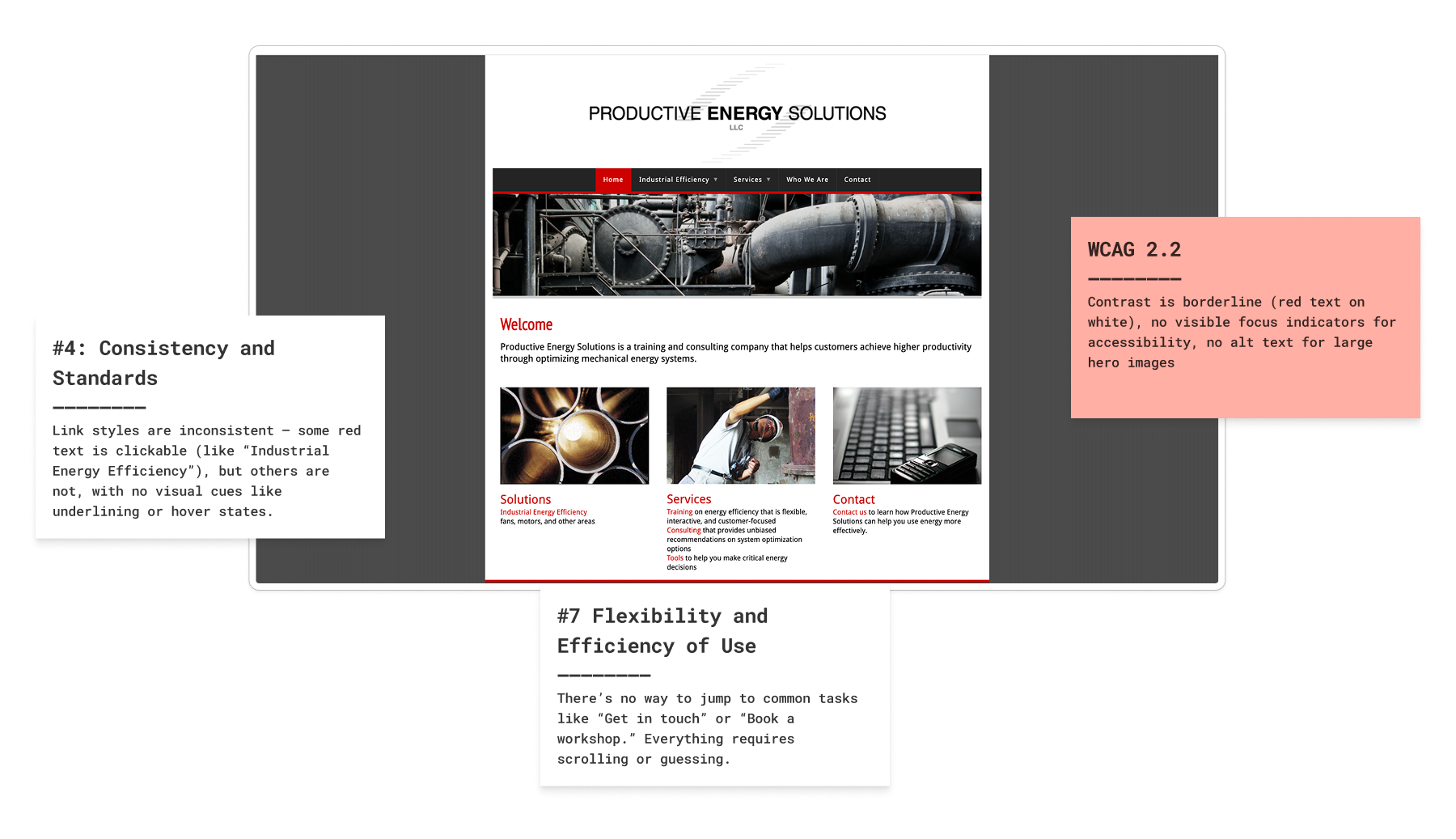
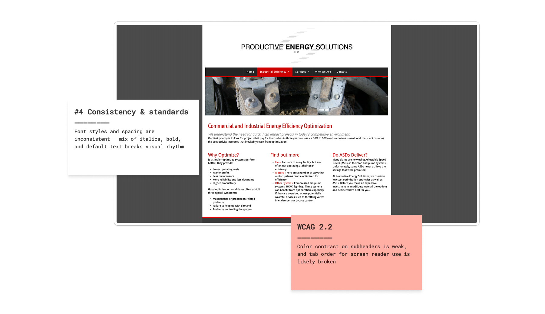
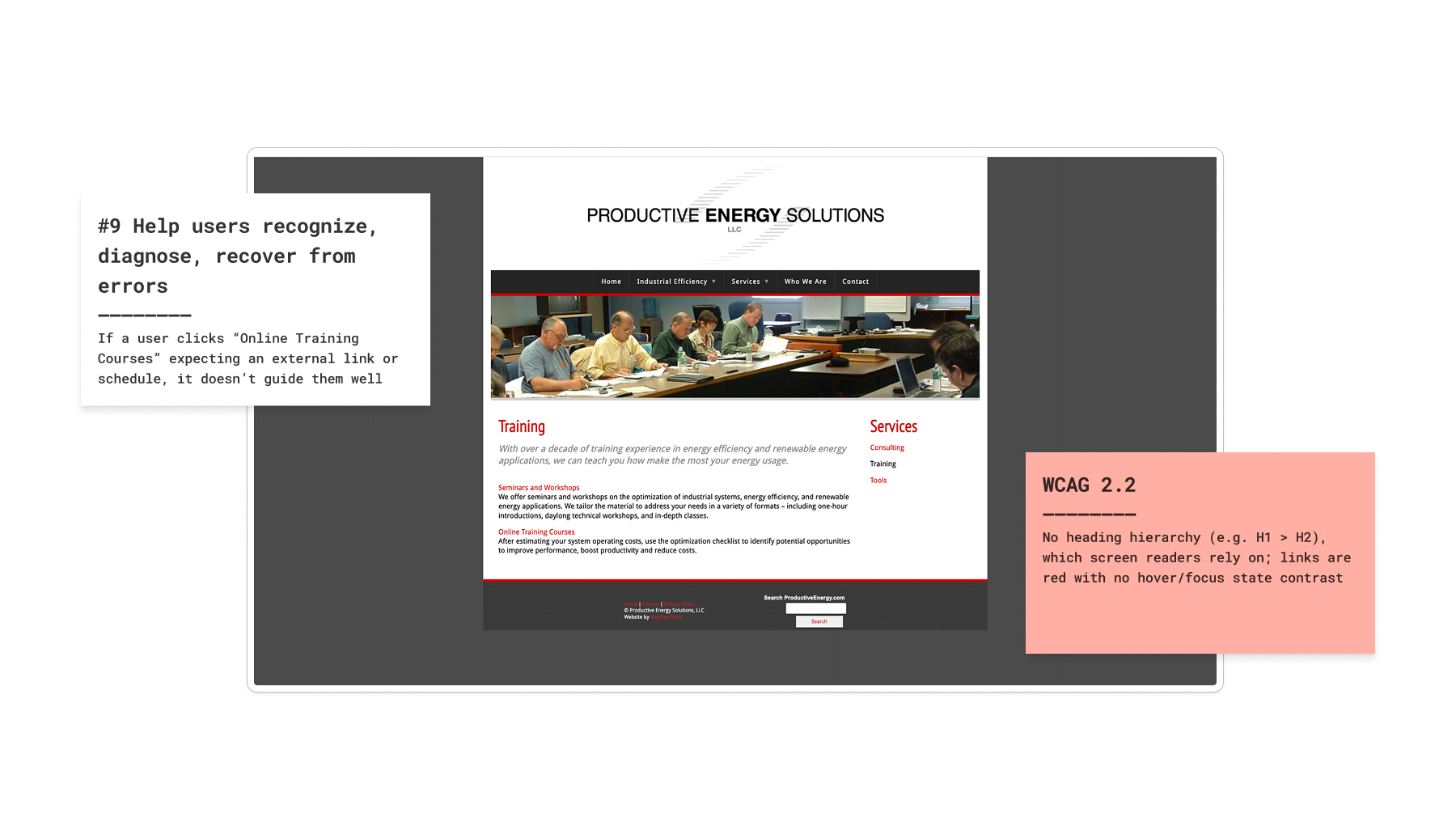
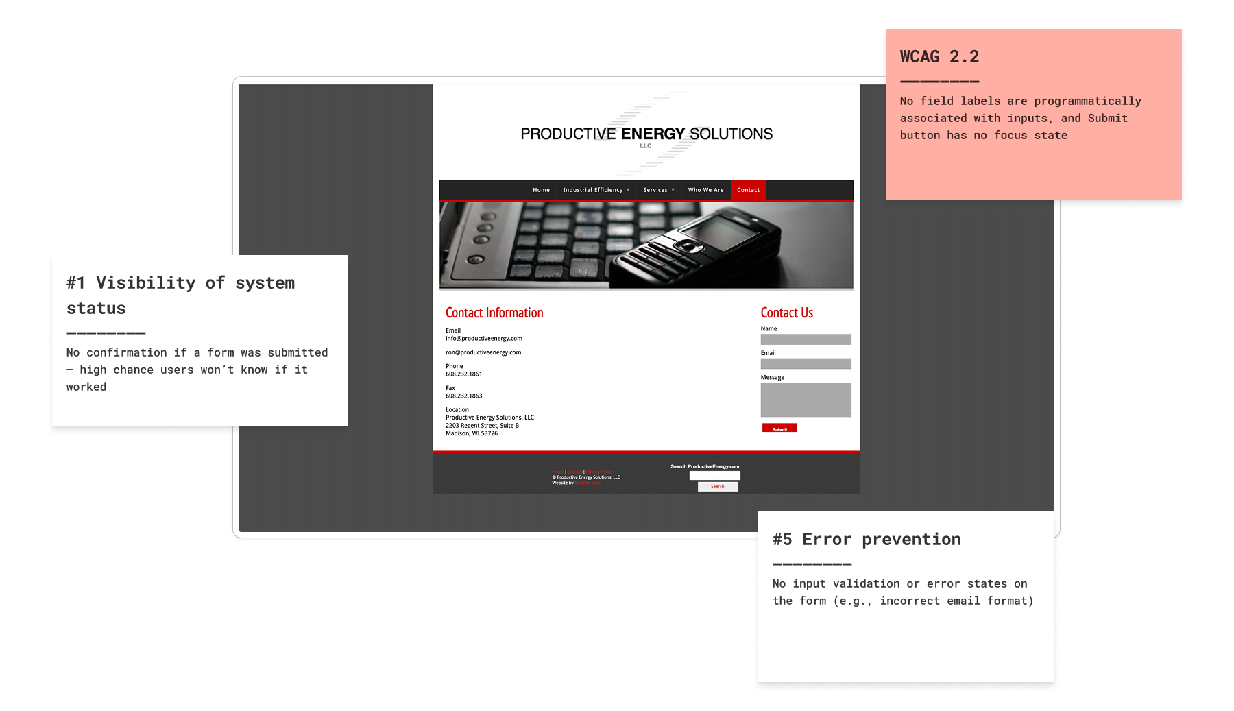
Evaluated 5 pages, flagged 9+ heuristic and WCAG violations — used insights to drive redesign decisions
Competitive Benchmarking
When redesigning the PES site, I needed to understand what users expect from modern training and consulting websites — especially in technical or industrial fields.
I analyzed 3 industry-adjacent sites that offer similar services (e.g., energy consulting, HVAC optimization, technical training), looking specifically at:
Productive Energy's Older Website:

“Welcome” headline with no value prop
No CTA or training mention until 2 scrolls down
Navigation with 6+ vague items
Johnson Controls Website (HVAC)

Clear category (“HVAC Systems”) with visual context
Navigation is deep but scoped and searchable
Contact CTA clearly visible on-page
Subcategories shown immediately for drill-down
ENFRA Website

Strong, benefit-first headline: Create. Sustain. Empower.
CTA appears above the fold (“Learn More”)
Flat, focused nav (5 core items + login)
Projected professionalism through clean visuals and team presence
Reviewing competitor sites made it clear that industrial users expect clarity upfront, not vague messaging or buried CTAs. This benchmarking reinforced that even technical audiences need benefit-driven copy, clean navigation, and trust-building visuals from the first scroll.
Navigation was a major friction point. The old site had 6–8 menu items, many redundant or unclear. Beyond just renaming and restructuring the menu, I audited the full sitemap, removed low-traffic or outdated pages, and cleaned up dead links that were hurting both usability and SEO.
Older Sitemap


New Sitemap
Using Figma, I crafted a modular design system that brought structure and clarity to PES’s digital presence—while still honoring the original brand identity users trusted.


Style Guide
I reverse-engineered the existing brand materials, including past presentations and training PDFs, to extract consistent colors, type choices, and tone. From there, I expanded it into a modern, modular system that worked across devices while preserving the visual identity Ron’s clients already trusted.


Initial Wireframes
Refined layout and content from wireframes into a final UI
Final Designs


The legacy site wasn’t just visually outdated, it was structurally brittle. Rebuilding from the ground up gave me full control over performance, accessibility, and the flexibility to match Ron’s unique deployment constraints.
I built the frontend myself using a modern toolchain:
Global Reach Made Tangible
I designed a dotted-world map component that animates PES's impact across the globe, turning decades of experience into a visual proof point clients can immediately grasp. It adds professionalism without clutter, and aligns with the brand's humble-yet-seasoned voice.
Streamlined User Flows
The training used to be buried in vague menus. I rebuilt the flow so users now reach it in a shorter flow by a redirection flow from the Online training page.
Contact Without Confusion
Ron didn’t want a complex contact form. So I created a lightweight, sitewide overlay that offers two clear options: Email Us (with a pre-written subject line) and Copy Email.
This approach keeps things frictionless for both ends and is accessible on every single page.
The redesign brings the site significantly closer to WCAG 2.2 compliance, improving usability for screen reader users, keyboard navigation, and users with color sensitivity.
WAVE
I used the WAVE accessibility tool to audit both the original and redesigned PES website. The old site had almost no semantic structure, missing alt text, flat headings, and accessibility blockers for screen reader and keyboard users.
Old Website
New Website
Lighthouse Audit
Post-launch, I ran a Lighthouse audit to evaluate the site’s accessibility, performance, and best practices.

As part of the redesign, I also worked closely with Ron, the 70-year-old founder of PES, to make sure the new site aligned with his preferences and technical comfort level.
“I’m really proud of how the new website turned out. It not only looks great, but works exactly the way I hoped — and in some ways even better. Anmol brought both design thinking and technical polish to the table.”

Ronald Wroblewski
Founder, Productive Energy Solutions