A mobile-first redesign of Habitat for Humanity’s ReStore to streamline donating, shopping, and volunteering, while making impact visible and meaningful.
Role
User Experience Designer & Researcher
Duration
14 Weeks
Type
Academic Proposal Project
Tools
Figma

Fragmented Digital Presence
Users had to visit Facebook Marketplace or clunky forms, there was no unified experience.
Fragmented Digital Presence
Users had to visit Facebook Marketplace or clunky forms, there was no unified experience.
Fragmented Digital Presence
Users had to visit Facebook Marketplace or clunky forms, there was no unified experience.
Fragmented Digital Presence
Users had to visit Facebook Marketplace or clunky forms, there was no unified experience.
All-in-One Digital Platform
Replaced scattered tools with a single web app where users can easily shop, donate, or volunteer without leaving the site.
01
Frictionless User Flows
Modern, mobile-optimized forms guide users with clarity and ease, boosting sign-ups and reducing drop-off.
03
Emotional, Impact-Focused Design
Every action is tied to a real-world story, making contributions feel meaningful, not transactional.
02


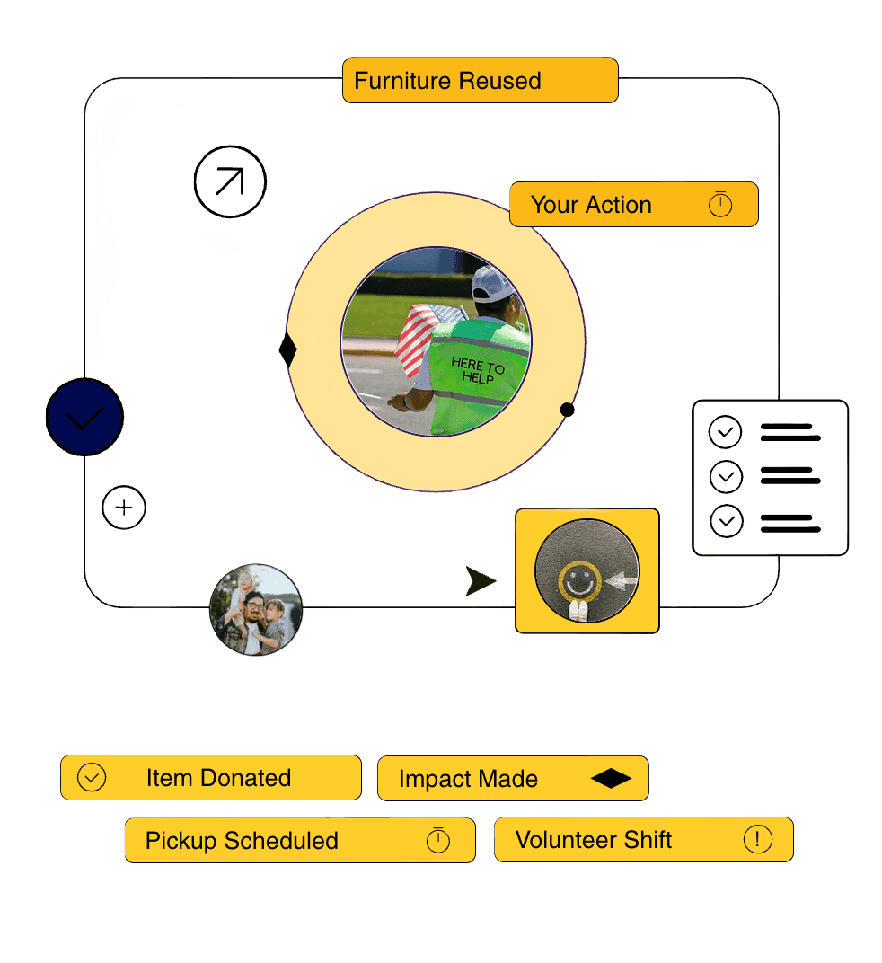
From Clutter to Clarity: A Donation Flow That Builds Trust
This flow walks through the redesigned donation experience: from choosing an item to receiving emotional confirmation.
The form is now mobile-friendly, with clear step indicators and helpful microcopy. Instead of ending with a generic “submitted” message, donors receive a personalized thank-you and a glimpse into how their item might be reused, turning a task into a moment of impact.
01
ReStore, Reimagined: A Shopping Experience That Feels Like a Real Store
This video showcases the updated shopping flow, replacing the old Facebook Marketplace model with a dedicated interface.
Users can easily browse by category, view product details, and check availability. The “Add to cart” and checkout flow are streamlined for mobile, and after purchase, buyers are thanked with a short note about how their purchase supports housing projects, reinforcing the purpose behind the product.
02
Purposeful Volunteering: A Clear, Encouraging Sign-Up Experience
his flow demonstrates how the new volunteer process removes uncertainty and adds purpose.
Instead of a vague form, users start by selecting the type of role they’re interested in, view quick previews of shift responsibilities, and get confirmation immediately upon sign-up. The final screen offers motivation by showing how their hours contribute to larger community goals.
03
Design Isn’t Complete Without Clarity
Every touchpoint, whether a button label or form layout, either builds or breaks trust. ReStore’s audience needed simplicity and reassurance, not just visual polish. Every decision was grounded in making their journey easier and more transparent.

Showing Impact Is as Crucial as Driving Action
In community-centered platforms, action without follow-through weakens engagement. I made sure that every donation, volunteer shift, or purchase ended with context, real outcomes, visible value, and acknowledgment of effort.

Iteration Is the Process
Quick prototyping and real-time testing shaped nearly every design refinement. Shifting icon placements, rewriting CTAs, reordering flows, all of it was driven by feedback. Good design isn’t static; it’s responsive.